Publication Details
| OLOR Series: | OLOR Effective Practices |
| Author(s): | Katharine H. Brown, Mark Smith, & Heesun Yoon |
| Original Publication Date: | 5 June 2023 |
| Permalink: |
<olor/ep/2023.06.05> |
Abstract
Accessible document design is essential for the removal of barriers to learning. This article explores how the authors retrofitted over 300 learning resource documents and PDFs for accessibility and published them in a new Open Educational Resource (OER) for University Writing at Auburn University. Working collaboratively, the authors learned about accessibility standards and the technical processes of creating accessible documents and PDFs. Using the four principles of document accessibility, including visibility, audibility, mobility, and searchability, the authors describe their retrofitting process and provide readers with considerations for document accessibility. Their article addresses OLI Principle 1: “Online literacy instruction should be universally accessible and inclusive.”
Resource Overview
Resource Contents
1. Overview
| Type of Institution: | 4 year, R1 higher education institution |
| Course Level & Title: | Not applicable |
| Course type(s) (asynchronous, synchronous, online, hybrid): |
Online (created an Open Educational Resource) |
| Delivery platform(s): |
Online, Microsoft Word, Adobe Acrobat Pro |
[1] Accessible document design is essential for the reduction of barriers to learning, particularly for students with disabilities. During the summer of 2021, our team of four student workers retrofitted over 300 learning resources for accessibility and published them in a new Open Educational Resource (OER) for University Writing (UW) at Auburn University. These resources included a wide range of handouts created for UW’s programs and services over a decade. A few examples of resources we retrofitted include:
- Rubrics designed for faculty to assess ePortfolios
- Informational handouts on source citation styles
- Writing warm-up prompts
- Worksheets to guide writers’ peer review process
- Multiple-choice questions and checklists for writers to self-assess their own writing.
[2] Working collaboratively, we learned about accessibility standards and the technical processes of creating accessible Word and PDF documents. In this article, we discuss four principles of document accessibility and demonstrate our retrofitting process. We hope to encourage educators to act for equity by addressing the accessibility of their learning resources, using this article as an introductory guide to document accessibility practices.
Background and Contextual Details
[3] UW at Auburn is an academic support unit that serves student and faculty writers across disciplines. Its mission includes:
- "Supporting students as thinkers and communicators by helping them become better writers through sustained and personalized services, […,] and
- Reaching more students by partnering with instructors who teach high-impact, discipline-specific, writing-focused courses and curricula" (University Writing, 2022).
[4] UW offers a range of programs and services to students, faculty, staff, and administrators, such as a writing center, in-class workshops, writing retreats, and semester-long writing intensive programs. To support learners participating in these programs and services, members of UW’s team had created over 300 teaching and learning resources throughout its decade of existence; these resources addressed writing genres, tasks, and challenges and equipped writers with strategies for their writing projects. Designed to function as handouts that can be used in print or digital formats, these resources had been created using the versions of Microsoft Word and Adobe Acrobat available at the time.
[5] In recent years, UW adopted Universal Design for Learning (UDL), a framework that helps educators design learning materials that remove barriers to learning and empower learners (CAST, 2018). In alignment with UDL’s emphasis on accessibility, UW established the standard that all its resources must be made accessible. This standard required UW’s staff to train in document accessibility and redesign its resources with the goal of creating an inviting learning environment for learners with disabilities.
[6] To better reach students and faculty across campus during the COVID-19 pandemic, UW decided to publish its teaching and learning resources to a new, accessible OER. However, many of its resources required significant retrofitting for accessibility in compliance with UDL and Web Content Accessibility Guidelines (WCAG) 2.1. To address this need, the OER Team was formed; it consisted of Katharine H. Brown, a graduate program assistant; Mark Smith and Heesun Yoon, undergraduate program assistants; and Ved Deepak Soni, a graduate peer writing tutor. The team’s tasks included retrofitting over 300 resources for accessibility in Word and PDF formats and publishing them to the OER.
[7] The OER Team established a foundation for future accessibility improvements at UW, as our efforts represented a concerted push towards a standard for accessibility. As a first step toward aligning UW with accessibility best practices, the OER Team retrofitted all of UW’s existing documents for accessibility, many of which required significant reworking to bring them into alignment with current standards. Once retrofitting was completed, UW began to offer campus-wide trainings in document accessibility through the Office of Human Resources. By offering these trainings, UW is acting as a resource for the Auburn community and encouraging others to adopt accessibility as a standard practice. We hope to expand upon this effort in future years.
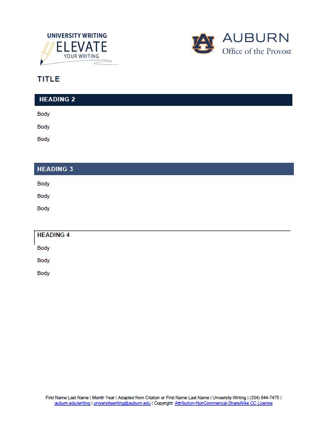
[8] UW’s documents are designed for readability, navigability, and searchability, as is the OER. The importance of giving learners a familiar experience each time they open one of UW’s documents cannot be overstated. We believe that learners who interact with our resources will gain familiarity with our document design and will benefit from our consistent approach to organizing material. Our resources are designed to allow learners easy access to content while avoiding the frustration that can result from inconsistent and inaccessible document design. UW created consistency in the OER by designing a Word document template for this project (see Figure 1). The template communicates UW’s brand and creates a consistent appearance across resources. It is formatted for accessibility, with elements such as headings, high-contrast colors, and sans-serif fonts. Its footer credits resource authors and shares copyright licensing for use and reproduction.
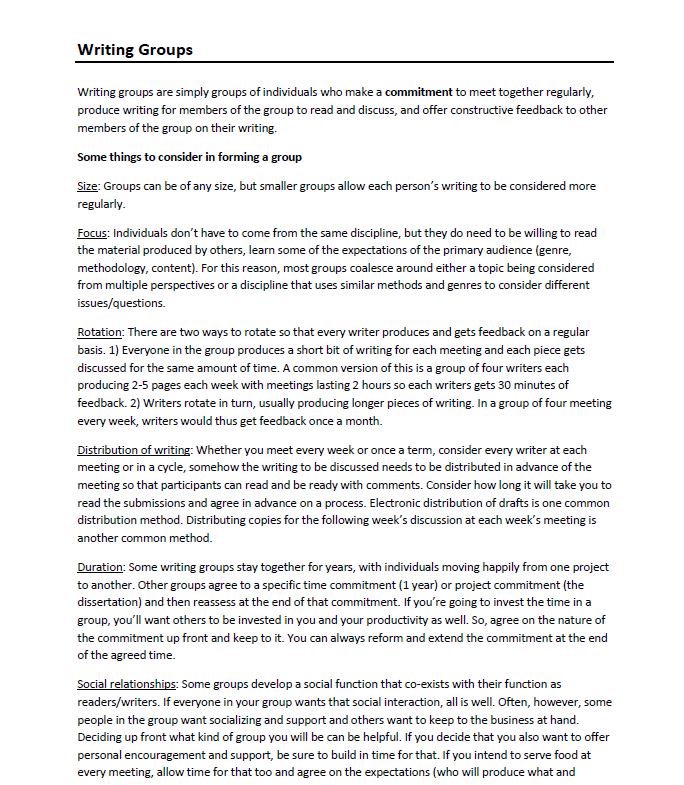
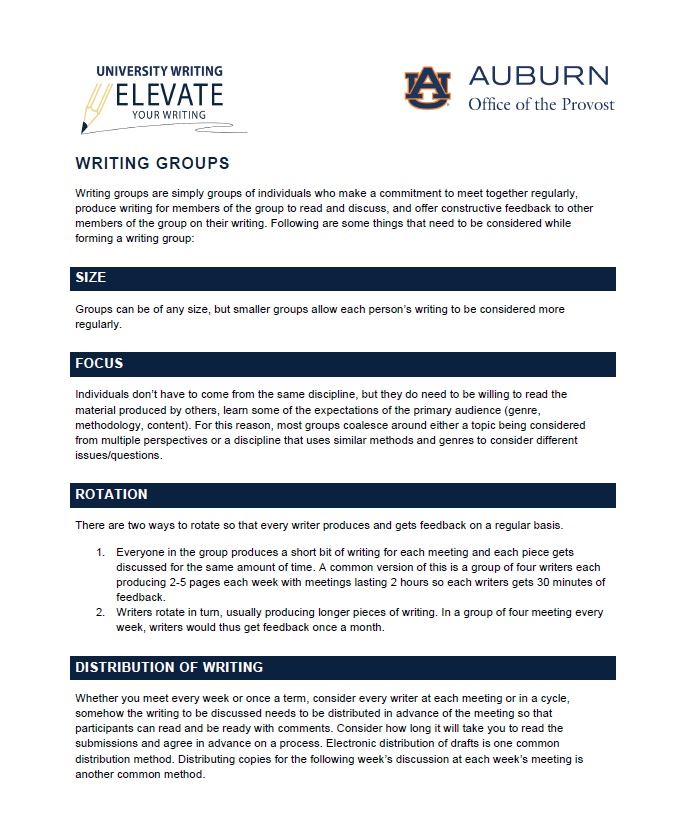
[10] Figure 3 shows a snapshot of part of the first page of our retrofit of the same multi-page document. In our retrofit, we copied and pasted all text into the new template, added navigable headings to break up the paragraphs, and converted a bolded phrase to a sentence in the introduction. Finally, we converted the numbered sentences under the “Rotation” section into a numbered list (called “List Paragraph” in Word’s built-in styles menu) to allow additional navigation options for screen readers. The OER Team’s emphasis on consistent design choices provided readers a familiar pathway to interact with a larger set of resources.
2. Implementation
[11] As the first phase of the project, the OER Team retrofitted all resources in Word document format using the template shown in Figure 1. We began with Word documents for several reasons. The OER Team was new to accessibility practices, and Word documents were a good introduction to document accessibility, as they can be made accessible with less labor than PDFs. During weekly OER Team meetings, Katharine offered accessibility trainings, and the team collaboratively addressed difficult documents. Throughout the first phase of the project, Katharine reviewed the team’s retrofitted documents and provided feedback on any final retrofitting steps required. The team wanted to finalize all Word documents before converting them to PDFs, as any issues in the Word documents would carry over to PDFs.
[12] As the second phase of the project, we produced accessible PDFs from the retrofitted Word documents. PDFs require significant labor to achieve accessibility, but we knew many users would appreciate that PDFs allow interaction with fillable text boxes, as well as versatility in what applications can be used to open documents. After converting retrofitted Word documents to PDF, we added fillable text fields, checkboxes, and radio buttons to enable users to interact with the content. Fillable text fields allow learners to type their responses to worksheet questions within the PDF. Similarly, checkboxes are an interactive element that allows learners to complete checklists within the PDF. Finally, radio buttons are a feature for multiple choice questions; they allow learners to select their response to each question by selecting a single bubble. Finally, we set the reading order to allow screen readers to flow through the document correctly. Setting the reading order was the most complex part of our work with PDFs; the reading order communicates to screen readers the correct order to read the document, as well as the kinds of content in the document (i.e., headings, images, tables, etc.). We demonstrate the process of setting the reading order in our “PDF Document Accessibility Demonstration” video (see Video 2 below). These changes met our project’s minimum standards for PDF accessibility, but we realize these PDFs do not achieve full accessibility.
[13] As the third phase of the project, we published the resources to the OER. Given the scope of the project, as well as the fact that the OER Team was composed of student workers who would soon graduate and take their expertise to other workplaces, the OER Team designed a new process for UW to use moving forward. Each member of UW’s team is now responsible for creating resources ready for publication to the OER. Katharine and Mark continue to maintain and update the OER with resources prepared by UW’s team; however, they no longer retrofit resources for others. Recently, Katharine and Mark trained all incoming graduate assistants in document accessibility, emphasizing four principles of accessible document design, which we discuss in the following section.
Principles of Accessible Document Design
[14] In this section, we provide an overview of four principles of accessibility – visibility, audibility, mobility, and searchability – that our OER Team identified throughout the retrofitting process. We suggest that educators consider these categories as they design learning resources so that barriers to learning are reduced.
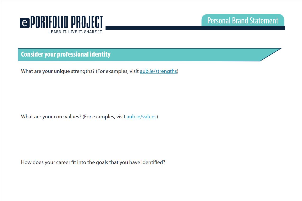
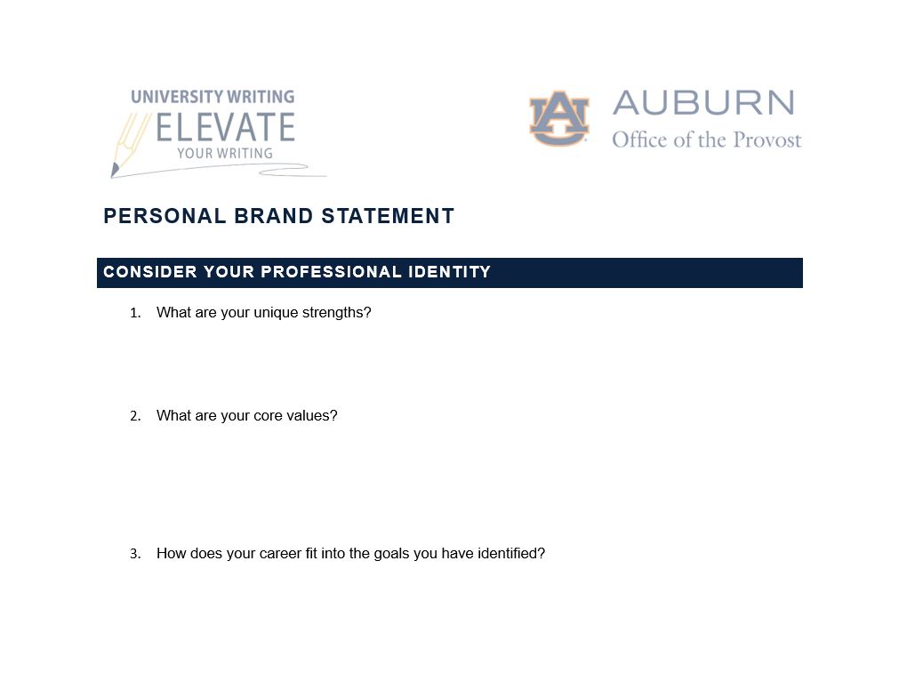
[15] First, we retrofitted documents for visibility by creating high contrast between the text and the page, selecting sans-serif fonts, and avoiding using color alone to convey meaning. The accessible Word template addresses visibility through its colors and fonts; however, we retrofitted for visibility beyond what the template could accomplish. We encountered resources that emphasized important content only through visual cues, like underlining, bold text, or color, which excluded users with visual disabilities. To make the meaning accessible, we added headings to indicate major and minor sections; at times, we wrote brief introductory statements or used bulleted or numbered lists to signal important content. These revisions allowed us to emphasize content without relying solely on visual cues. For example, Figure 4 shows a snapshot of part of the first page of a multi-page document we retrofitted called “Personal Brand Statement.” It features white text against a soft green color; this low contrast is inaccessible. Further, the questions are not in a numbered list, creating a barrier to navigability.
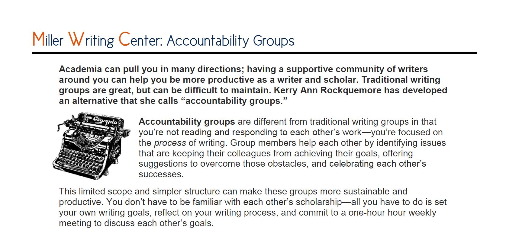
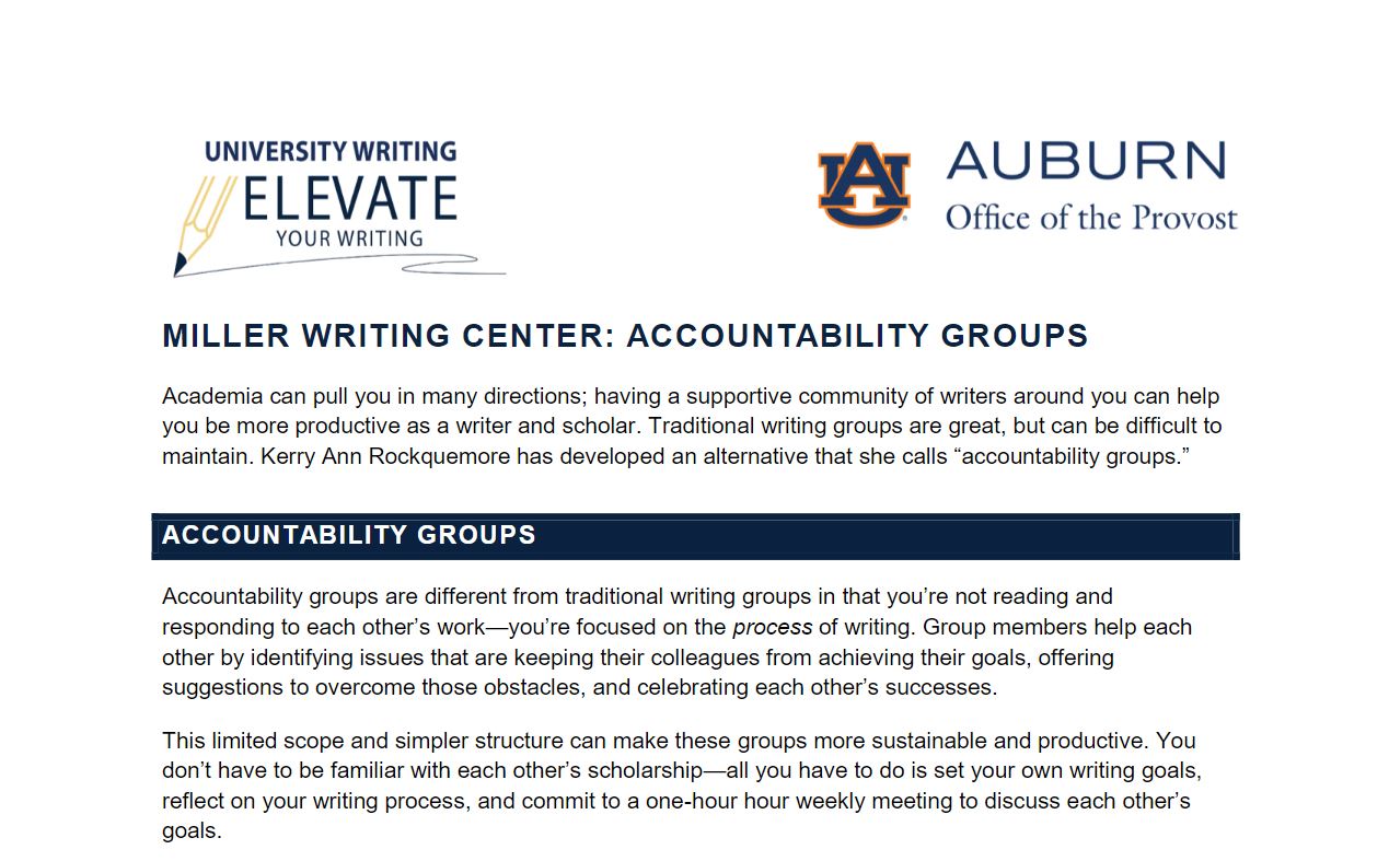
[17] Second, we retrofitted documents for audibility by embedding hyperlinks and using alternative text for visual elements. When URLs are directly pasted into the text, screen readers will read out every letter (e.g., “h-t-t-p-s-colon-slash-slash…”), which can be very difficult to follow, so we embedded links in the associated text. We also assessed visual elements to determine whether they were there for decorative or instructional purposes. As we show in the video, “Word Document Accessibility Demonstration” (see Video 1 below), decorative images can be retained and marked as decorative, and they will be ignored by screen readers. However, we decided to delete decorative images and only retain those with an instructional purpose that also had a creator credit and licensing for usage. To each image that remained, we added brief, descriptive alternative text, and we wrote captions to interpret the image and share creator credit and licensing information. For example, Figure 6 shows a snapshot of part of the original version of UW’s “Accountability Groups” document. This document has decorative clip art with text wrapping; text wrapping creates an accessibility issue because it can interrupt the reading order. Images should always be “in line” with text, which moves the image onto a new line without text surrounding it. When we retrofitted the document (see a snapshot of part of the document in Figure 7), we decided to delete the clip art. Rather than relying on bolding to indicate important content, we utilized headings to separate content, knowing that screen readers read bold text in the same way as normal text.
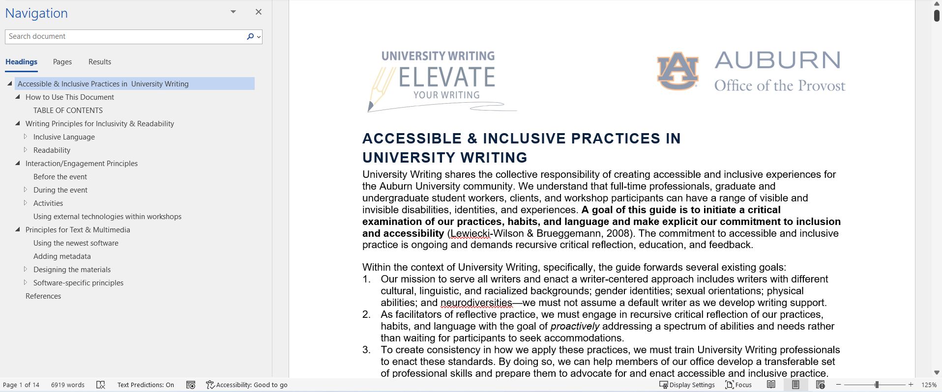
[18] Third, we focused on mobility within the documents; we understand mobility as the ease with which users can navigate a document’s content. Quick navigation through a document is possible through heading styles, which indicate sections of a document. Microsoft Word generates an outline of the document’s content based on the headings used; this outline can be accessed in the navigation pane, and it allows readers to quickly maneuver amongst the sections of the document. However, headings must be used in a correct hierarchy, or they will create more confusion than clarity. The title of the document is always assigned as “heading 1.” As part of the hierarchical structure of headings, “heading 2” is a subheading to “heading 1”; “heading 3” is a subheading to “heading 2”; and so on. Using headings makes it easier for the user to locate information, especially within long documents. For example, in Figure 8 the navigation pane is open to show how a user can easily locate content within the 14-page document using headings. Since headings are strategically used, all sections and sub-sections appear in the navigation pane, allowing learners to flow through the document and go to the information they need.
[19] Lastly, we retrofitted documents for searchability by adding metadata to aid readers in locating resources appropriate to their needs. We added metadata by tagging Word and PDF documents with descriptive keywords, authors, and the title. Our OER resources are saved in Box (a cloud storage platform) and linked within the OER, where they are organized using the same descriptive keywords that we used in the metadata. These keywords appear in a sidebar of the OER, so users can select any that fit their interest. Additionally, metadata allows users who have downloaded OER documents to search across documents, quickly locate relevant materials, and preview content without having to open them. We demonstrate the process of adding metadata in our “Word Document Accessibility Demonstration” video below (see Video 1).
Document Accessibility Demonstration
[20] In Video 1 below, Katharine demonstrates the OER Team’s process of retrofitting a resource for accessibility in Microsoft Word. Katharine demonstrates how the team used headings, embedded hyperlinks, incorporated images, formatted tables, added metadata, and used Word’s accessibility checker.
[21] In Video 2 below, Mark demonstrates the OER Team’s process of creating an accessible PDF, the second phase of the project. Mark demonstrates how the team converted a Word document to PDF, accessed important tools within Adobe Acrobat Pro DC, added fillable form fields, set the reading order, and used the accessibility checker.
3. Conclusion
[22] We believe that accessible document design reduces barriers to learning and promotes educational equity. We hope that online literacy instructors will benefit from our discussion of document accessibility principles, as well as our demonstrations of the process we used to create accessible Word and PDF documents. While this article does not attempt to offer a comprehensive guide to document accessibility, we hope that it encourages instructors to consider how they can design accessible documents for their teaching contexts. For more information on accessibility, please explore the OER’s section on accessibility. Here, you will find the Accessibility and Inclusivity Guide that we used throughout the project (Miron & Cicchino, 2021), as well as other materials on document and web accessibility.
[23] Throughout the OER project, we encountered some challenges that may be experienced by others creating an OER or retrofitting a set of documents for a classroom. Although we used accessibility checkers as a final step in retrofitting resources, these software programs can only diagnose a limited set of issues. Furthermore, some resources required significant strategizing to be made accessible; in one instance, Mark and Heesun worked independently on two similar resources with significant accessibility issues, and each made correct yet different decisions on how to address those issues. When Katharine reviewed these documents, she chose one method and revised one resource to create a consistent experience across documents. We also had a large number of resources that posed significant challenges, which we addressed in our regular team meetings. For example, one team member encountered a resource with a large table that had nearly 200 cells, 168 of which were fillable form fields. After 3 hours of work attempting to correct the table’s reading order in PDF format, we decided to stop our efforts and rely on the fact that we were also offering the resource in Microsoft Word, which has superior features for navigating tables. We now ask UW’s staff to avoid creating resources that utilize tables, and instead ask them to present content in a different way. Finally, we found the large volume of resources overwhelming; to manage this, we maintained a spreadsheet that listed every resource, assigned each to a different team member, and tracked our progress. We also looked for opportunities to recognize our progress in team meetings and to identify a reasonable, flexible timeframe to complete the project (5 months). Having a large team with a clear workflow aided our project, and we held weekly or bi-weekly meetings to learn together and to collaboratively address the project’s unique challenges.
[24] We conclude with a list of takeaways for educators who are designing accessible learning resources for their students or for an OER. We have organized takeaways around the four principles of accessibility described earlier: visibility, audibility, mobility, and searchability.
[25] Visibility
- Use sans-serif fonts (i.e., fonts without icicles or feet attached to the letters).
- Use high contrast colors, such as black text on a white page.
- When using color, check the contrast using the Paciello Group's Colour Contrast Analyser, a free software program.
- Avoid using color alone to convey meaning.
- Layer visual elements to emphasize content. For instance, the same text can be stylized using bold, italics, and a unique color.
[26] Audibility
- Embed hyperlinks within the text.
- Write alternative text for all instructional images.
- Mark decorative images as decorative so they don’t appear in the reading order (see our “Word Document Accessibility Demonstration” for an example of this).
- Write captions that interpret figures, graphs, and images.
- Check the reading order of PDFs and add any missing content in the correct order, such as fillable form fields or any necessary footers.
[27] Mobility
- Use headings that allow readers to navigate amongst sections of the document. Headings should be used in correct hierarchical order, with the title as Heading 1, main sections as Heading 2, and sub-sections as Headings 3, 4, and so forth.
- Heading styles are built into Microsoft Word and can be customized to match educators’ brand. Design headings that are visible, such as through using sans-serif fonts and high contrast colors.
[28] Searchability
Add metadata to your documents, as follows:
- Title
- Author(s)
- Keywords, which are searchable by users who have downloaded documents onto their computers. Use keywords consistently across documents so related ones can be easily located.
4. References
CAST (2018). Universal Design for Learning guidelines version 2.2. CAST. http://udlguidelines.cast.org.
Miron, L. & Cicchino, A. (2021, July). Accessible and inclusive practices in University Writing. University Writing. https://auburn.edu/writing/resources.
University Writing. (2022, June 3). Mission statement. Auburn University. https://www.auburn.edu/writing/about/mission-statement/.


